Shortly before Christmas, I sold my Cybook Opus – which I loved, if you recall my review – and purchased an Amazon Kindle. I have been enjoying it for the past few days, so here is my review for it, especially with regard to how it compares to the Opus.
If, after reading this post, you decide to purchase a Kindle, please do so using the links at the bottom; that way, you support this blog’s costs and expenses.
I cannot provide side-by-side comparisons because I sold the Opus before receiving the Kindle, but I used it for the last year and a half, so I am very familiar with its merits and its shortcomings.
The first thing I noticed is the screen. In addition to being slightly bigger, six inches versus the Opus’s five, the e-ink technology is – not surprisingly – better. The Kindle supports 16 shades of grey rather than the Opus’s 4, and the background looks brighter and the text darker. It is worth pointing out that while the Kindle’s screen is bigger, it is theoretically less sharp because the resolution is the same (800 x 600 pixels). In practice, however, the Kindle still appears better due to the improved technology, dubbed “e-ink pearl.” Amazon shows it off to great effect by employing detailed (and no doubt optimized) pictures as screensavers when the reader is not in use.
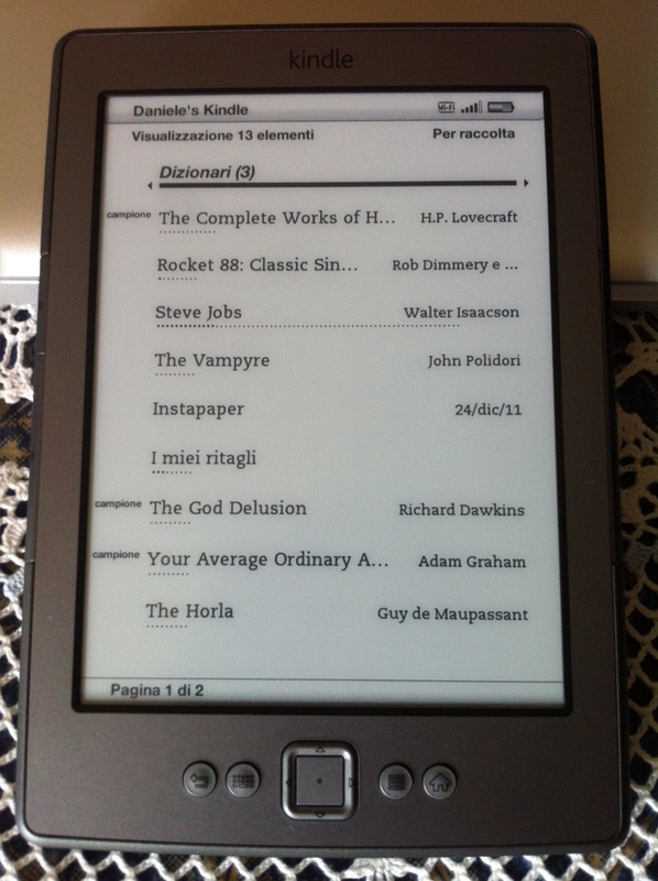
A big difference between the Opus (and I imagine most “third-party” readers) and the Kindle lies in the file handling. The Opus acted essentially as a file manager, listing the actual folders on the flash storage and the files therein. The Kindle, on the other hand, has a stronger “iTunes-y” attitude: it indexes the files and shows them all together, but it does allow for the creation of “collections” which are akin to playlists rather than bookshelves, as the same book can be placed in more than one collection.
Adjusting to the reading experience required a little bit of effort for me. Whereas the Opus allows to move through the pages using the two buttons on the side or the left/right buttons of the d-pad, the Kindle has two sets of buttons on the sides (which are easier to press than the Opus’s, but also easier to press by mistake), and the left/right buttons of the d-pad move through chapters. This was somewhat unsettling at first, since I found the buttons on the side of the Opus to be quite stiff and often just used the d-pad.
Having a set of buttons on each side, however, makes it easier. I wound up finding that the most comfortable position for me is holding it with my left hand, so that I can also press the forward page button with my left thumb (once again proving that nobody is completely left- or right handed!) One thing to notice: holding the button down does not trigger continuous page-turning. Given that it’s easy to accidentally press them, this is actually a good thing.
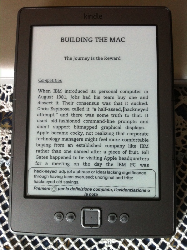
At any moment, as shown in the picture above, it’s possible to show a cursor by pressing up or down on the d-pad, and then browsing to any word. This shows a dictionary entry for the word in question (the Kindle comes preloaded with dictionaries in English, Italian, French, Portuguese, Spanish and German) and, by simply pressing the center button, it’s possible to obtain a full definition, create a note or highlight some text.
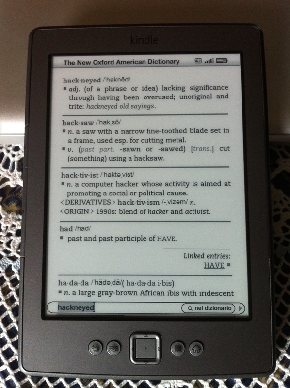
The dictionaries are top quality, and do not require an internet connection since they are local to the device. As an extra bonus, the dictionaries are not only searchalbe using the on-screen keyboard (which is brought up using the dedicated button, and is the only frustrating trait of an otherwise wonderful device), but it’s possible to use the cursor to follow links or, recursively, look any other word up. It’s pretty neat.
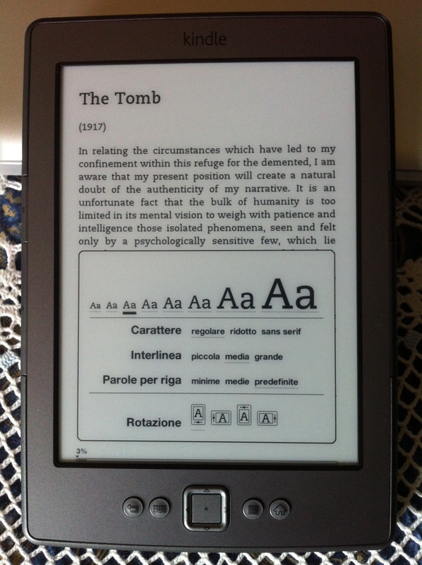
Visual settings can be tweaked as necessary. While the Opus allowed the usage of any TrueType font and provided a dazzling 12 different font sizes, the Kindle aims for a standard experience with only three fonts (and no possibility to use custom ones) and 8 font sizes. The default font is quite thick and increases the awesomeness of the screen even further, but there’s a condensed version of it and a sans-serif typeface for those who prefer it. It is also possible to change the line spacing and, by operating on the “words per line” setting, the side margins. I suppose that this is for those who prefer to have a side grip on the device and risk eclipsing part of the text with their thumbs. Four different screen rotation positions are available, but there is no accelerometer so it has to be changed manually.
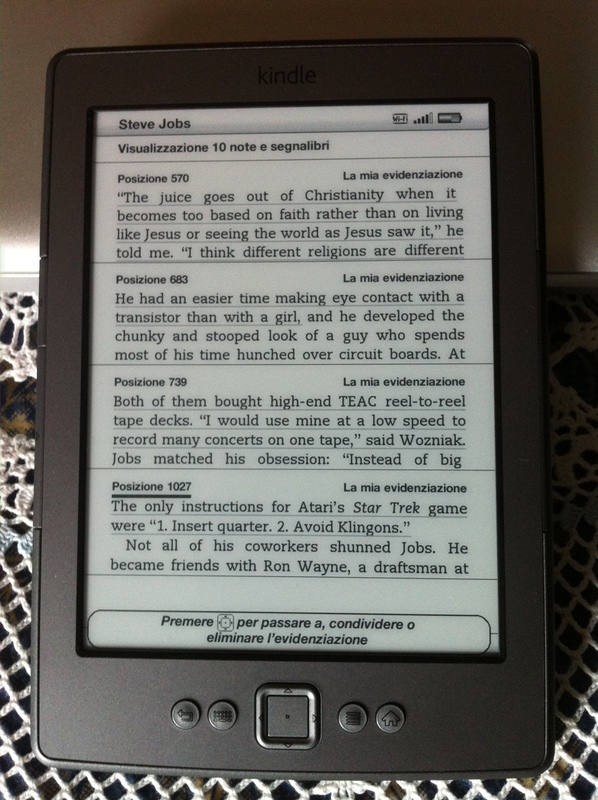
Highlights, notes and bookmarks can be quickly accessed using the relevant function while reading a book. Highlights and notes from all books are also kept in a special “book” called “My clippings”, which contains all of them in a slightly confusing syntax that vaguely appears to be following an unspecified style manual.
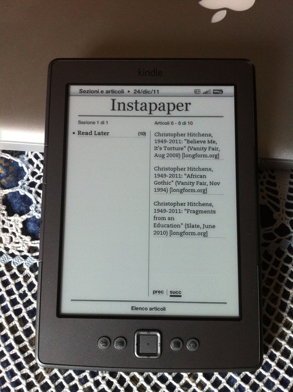
A very interesting feature is the ability to purchase magazines. While I haven’t attempted to subscribe to any, these are supposed to be delivered wirelessly to your device (more on that later). An example can be had by using Instapaper’s Kindle Wireless Delivery extra (free), which shows how articles are divided in sections, though only one in this case. Since the Kindle is an internet-aware device, it’s particularly well suited to reading contents archived on Instapaper, since the “archive” link at the end of each article can be followed easily to let the website know that the article should be taken out of the way.
Indeed, a very neat function that is only possible thanks to the data infrastructure Amazon has is that virtually anything can be delivered to the Kindle wirelessly. When registering the device, you are given an email address to which you can send files (unencrypted mobi ebooks, PDFs, etc.) which are bounced back to your Kindle via wireless within 10-15 minutes. Moreover, every other Kindle device you have registered under the same account – and that also includes the Kindle for iPhone, iPad, Android and Mac / PC apps – are able to download the same contents and synchronize highlights, notes, and the last read page.
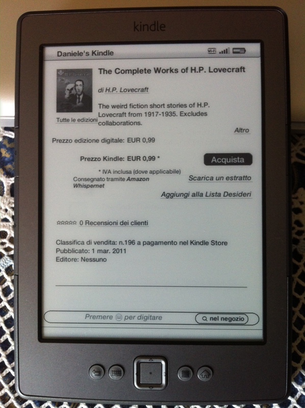
Perhaps the “killer app” for the Kindle is the huge bookstore that’s available not just on Amazon’s site, but from the device itself. It’s literally two button taps away, and at the time of writing the Italian store has 17,504 books in Italian and 992,470 books in other languages, and from what I can see, all of them let you download a short sample to help you decide whether you want to spend money on it or not. It’s incredible. It is true that you end up locking yourself into Amazon’s DRM cage, but it’s also true that you can read these books on any Kindle device, including mobile phones and computers, and you get all the synchronization goodies I mentioned before (though they are available on any file, provided it’s sent to the personal Kindle address assigned to you; files loaded via USB will not support such features because they are not “known” by the Amazon synchronization servers.)
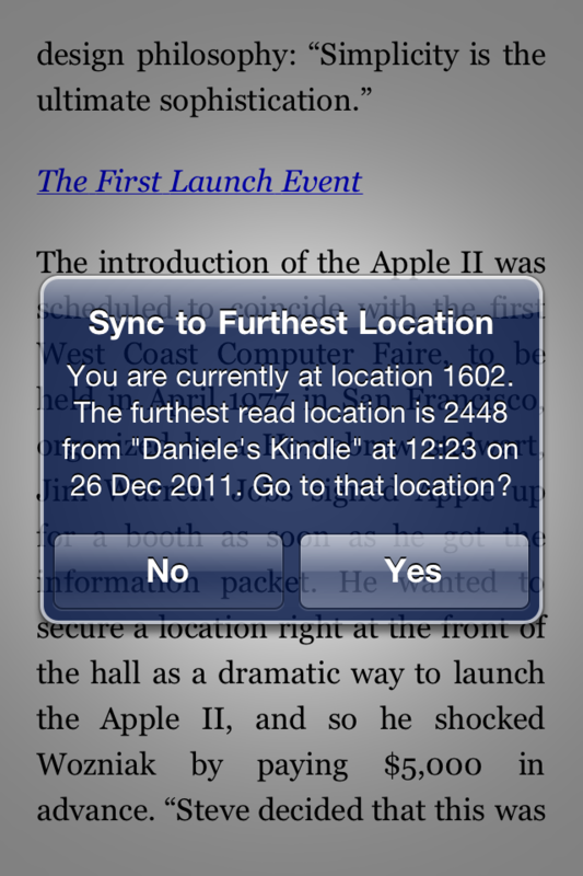
Indeed, I can’t even describe how elated the “furthest page read” synchronization makes me. I can read a book at home on my Kindle, then pick it up on my iPhone when I’m somewhere else just where I had left it. And when I get back to my actual Kindle, I can resume my reading from wherever I had arrived on the iPhone. It’s very, very, very neat.
All in all, I am extremely satisfied by the Kindle. The only missing thing is a cover, but that’s something that can be purchased separately and I definitely plan to get one after the holidays. Would I go back to the Opus or another “third-party” reader? Not at this stage. While it’s true that you find more material in epub format, the free software Calibre does a great job of converting unencrypted epub to mobi. Moreover, most DRM-free stores also provide mobi files directly, and the huge assortment from the Kindle Store makes it a non-issue anyway.
If you are interested in purchasing a Kindle, please do so by using the relevant link for your country:
Complimenti per i centrini, bellissimi come sempre.
Una mattonella ce la potevi far capitare però! : )